What the Digital Foundations blog was
05-Oct-18
This blog was active during the writing process for the Digital Foundations book. It is preserved here as a static archive.
This blog was active during the writing process for the Digital Foundations book. It is preserved here as a static archive.
Digital Foundations has received some eclectic and exciting praise. I have included some choice bits below, but my favorite are the numerous peers who have said more or less the same thing: “This is the book we have all been waiting for!”
This book is critically important for the arts. Far too few artists are sophisticated enough to be aware of the stealthily growing problem at hand: Corporate, cookie-cutter tools—and their manuals—that standardize and cramp creativity threaten to become the greatest shapers of late 20th & 21st century art, just as architecture’s greatest influence this past century has unfortunately been neither a renowned school of architecture, nor even a great architect, but the catalog of standardized options: door frames, windows, and other prefab parts, from which 99 percent of structures are now built. Artists will remain stuck with old patterns and limited options, unless we create viable open source alternatives and brilliant interventions like this book!
John S. Johnson
Chairman of the Pacific Foundation
Founder of the Screenwriters Colony, The Filmmakers Collaborative and Eyebeam, Art + Technology centerThis is how I would describe the experience of reading Digital Foundations: I have learned to speak, say Swahili, because I’m hanging out with a lot of Somalians. It takes me a few years maybe, but by now I’m pretty good at it. Then I come across this book, “How to speak Swahili” that goes over all the basics. And I’m like, whoa I’m glad I don’t have to learn Swahili all over again, this shit looks confusing, but this book makes it look so easy! (big sigh of relief) Then I find some vocab I never even knew! That will come in handy…
Xan Young
architect, Aedas LAXan Young, a friend and architect

xtine and I have been quietly working on two new books, one on Digital Imaging and Collage and the other on Web Design. You can see the works in progress on the Digital Foundations wiki

I had been wondering about this. The NY Government paid for it, so it should theoretically be the property of the so-called people, but they are busy suing other people for using it. Milton Glaser did it pro bono. Oh, copyright…
New York officials show no mercy in their bid to protect the “I ♥ New York” logo. The trademark, supplied free of charge by graphic designer Milton Glaser in 1976, helps beckon 140 million tourists to the Empire State each year. As others tried to tap the design over the years, state legal eagles have filed close to 3,000 trademark objections.
White House goes CC. From the white house site (right next to George Washington’s face):
Pursuant to federal law, government-produced materials appearing on this site are not copyright protected. The United States Government may receive and hold copyrights transferred to it by assignment, bequest, or otherwise.
Except where otherwise noted, third-party content on this site is licensed under a Creative Commons Attribution 3.0 License. Visitors to this website agree to grant a non-exclusive, irrevocable, royalty-free license to the rest of the world for their submissions to Whitehouse.gov under the Creative Commons Attribution 3.0 License.
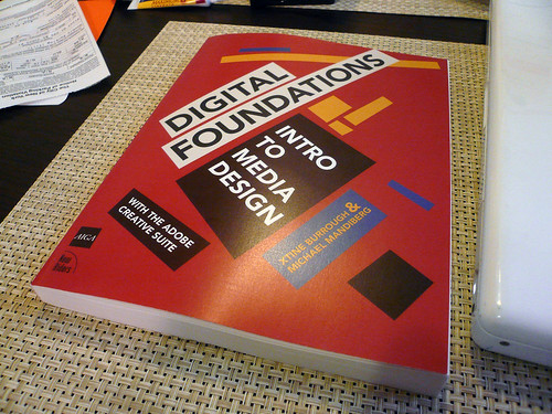
xtine burrough and I just published Digital Foundations: an Intro to Media Design with the Adobe Creative Suite with AIGA Design Press/New Riders under a CC license (a first for the publisher.) The book teaches the formal principles and exercises of the Bauhaus through lessons in the Adobe Creative Suite. There are a whole spate of reasons why we wrote this book, but the focus of this post is on how we were able to negotiate the Creative Commons license from New Riders, which is owned by Peachpit, which is owned by Pearson (a big big corporate big thing.)
1. Figure out what you want and ask for it
Every contract is negotiable. Choose what you want and ask for it. Do not be afraid to ask for it. In our case, we focused on getting Creative Commons licensing into the contract, but we also asked for and received other modifications, including a higher percentage of royalties after a certain number of books sold, a stipend to design the book and ownership of the book layout and design (which we licensed CC).
2. Know that your publisher is scared
Publishers saw what happened to the music industry. Sales of print books are down across the board. Publishers know things are going to change, but they don’t know what that change is going to be. Know that your publisher is willing to experiment. “Inspire them to be leaders.” (ironic, but serious)
When we set up our own domain, showed the publisher the wiki (licensed CC, well before we signed our contract), and our blog, we were kind of scared they would be upset with us. We were surprised and relieved when they sent it around to everyone in the company as a model of how to use wikis and blogs. It was something they had been thinking about trying to do, but hadn’t. Be the leader.
3. Show them the money
Ultimately, it is all about the bottom line. Mark Hurst has written a no-holds-barred analysis of how much it is all about the bottom line. Your central argument has to be “you will make more money.” Sure, you may be more interested in free culture, collaboration, or maximizing mindshare, but someone in the decision process will need to be convinced that it will increase sales, or at the very least that it won’t loose them money.
4. Pitch it with facts
Use case studies to argue with facts. It also helps for them to see that other reputable publishers have licensed books Creative Commons. O’Reilly has some a study on an Asterisk book that we used very effectively.
http://radar.oreilly.com/archives/2007/06/free_downloads.html
The Asterisk book sold 19k copies over two years (about what comparable books from O’Reilly were selling), but was downloaded 180,000 times from *one* of the 5 sites that mirrored it.
Also consider google as arbiter:
Results from google search breakdown of references to the two books in the oreilly case study (at the time of negotiation, early 2008):
asterisk: 139,000 references in 2 years (2005-2007), or 70,000 per year
understanding the linux kernel, 42,000 references in 7 years (2000-2007), 6,000 per year
So there was 10x the press/blog/reference/hits for the CC licensed book.
And explain the the 75/22/3 breakdown:
“David Blackburn, a Harvard PhD candidate in economics, published a paper in 2004 in which he calculated that, for music, “piracy” results in a net increase in sales for all titles in the 75th percentile and lower; negligible change in sales for the “middle class” of titles between the 75th percentile and the 97th percentile; and a small drag on the “super-rich” in the 97th percentile and higher. Publisher Tim O’Reilly describes this as “piracy’s progressive taxation,” apportioning a small wealth-redistribution to the vast majority of works, no net change to the middle, and a small cost on the richest few”
and more here: http://tim.oreilly.com/pub/a/p2p/2002/12/11/piracy.html
And make the argument that of those who get the book for free, most of them wouldn’t buy the book in the first place. And in that group, there will be a small percentage of converts who will then go out and buy a hard copy of the book for themselves, or as a gift. This percentage of converts more than compensates for any loss in sales due to the free version.
5. Identify your advocates & the decision maker
Different publishers have different agent/editor structures, but in our case, we were working with an excellent Acquisitions Editor, who quickly understood our project, from the concept of the book, to the importance of Creative Commons. We convinced him, and he then convinced the Publisher.
Figure out who in the organization is the decision maker on the issue. Often this is going to be the Editor-In-Chief, or the Publisher. Figure out who the boss is, and figure out what their interest is in it. Know their motivation. Are they conservative? Push the profit potential. Are they known for groundbreaking books? Push the “new-ness” of the strategy. etc. In our case, we pushed profit potential, synergies (see below), bloggability, and newness/coolness.
6. Build partnerships and make CC plans
Early on a colleague put us in touch with Adam Hyde of FlossManuals.net, an social entrepreneur who has created a community based open source documentation site. We saw the huge potential of the Creative Commons license to “translate” the book from the Adobe Creative Suite to GIMP, Inkscape, and the other FLOSS applications; and because of the way their system works, it would then be translated into Farsi, Brazilian Portuguese, Spanish, etc. Showing this very concrete example of a tangible way that Creative Commons license would increase the book’s impact helped the Publisher see the power of the CC license.
7. Write it on a wiki.
Pre-emptively license it CC. Write your book on a wiki before you begin negotiations. Give the wiki a CC license. The wiki, or some other electronic version, is a different work, and therefore if you end up unable to convince the publisher, at least the wiki is CC. Other authors we spoke to simply published their manuscript on a wiki and gave it a CC license. While a lawyer might be able to give you an opinion about whether you can post a manuscript for a book and CC license that manuscript retroactively, I think it is safer to pre-emptively license your wiki.
8. Provide sample verbiage
Make it easy for them. Give them the verbiage. Some legal departments are going to rewrite the contract. Others are going to create a rider. Cory Doctorow was kind enough to provide us with the verbiage his agent wrote: http://www.boingboing.net/2007/03/20/model-contract-claus.html . This is the really simple language we ended up using:
“Publisher agrees to add the Creative Commons license designation to the Copyright page of the Work.”
This isn’t perfect, and we did have some further conversations when it came time to actually layout the title page. We probably could have been more specific about which license, but this is what their legal agreed to, and considering we were doing a CC-BY-NC-SA, which is the most restrictive, we were not super worried.
9. Do your CC homework
Allay any of their fears by doing your homework, and answering their questions. One of the issues that came up was the inclusion of (C) images in our CC licensed work. The legal department thought that might mean that we were infringing on the (C) of the images, forcing them to be CC. Similarly, we had concerns that the Public Domain images might be restricted by the CC license on the book, something known as Commons Enclosure.
After a number of phone calls and emails we got confirmation that in fact this was not true. Nathan Yergler of the Creative Commons Foundation wrote us to say
“You can use a copyrighted work, assuming you have the rights to do so (either under fair use or explicitly negotiated), in a CC licensed work so long as you point out the exceptions in the license notice. This is effectively what Creative Commons does with our website — see the footer text where it states “except where otherwise noted…”
And as I mentioned on the phone, Creative Commons can not offer legal advice or opinions and this should not be interpreted as such.”
Of course we could include (C) images in a CC book, we simply had to state that they were (C). Likewise, we stated on the front page of the book (right below the CC declaration) that all images in the book were Public Domain unless otherwise noted. The lawyers liked this.
10. Be patient
It will take a while. Keep writing on the wiki, and move ahead planning on your successful negotiation. Legal departments move very slowly. It took so long, I don’t even remember the dates. At least 6 months. But it took longer to write the book, so it didn’t hold us back at all! It will be worth it.
More links and info:
Digital Foundations:
http://www.amazon.com/Digital-Foundations-Introduction-Design-Creative/dp/0321555988
Article about Cory Doctorow’s successful use of CC:
http://www.locusmag.com/Features/2007/09/cory-doctorow-freekonomic-e-books.html
Example clause of CC contract:
http://www.boingboing.net/2007/03/20/model-contract-claus.html
CC info, a case study:
http://radar.oreilly.com/archives/2007/06/free_downloads.html
The 75/22/3 breakdown:
http://tim.oreilly.com/pub/a/p2p/2002/12/11/piracy.html
A while ago I wrote Nathan Yergler of the Creative Commons Foundation about the logistics of including (C) work in a CC book? Amazingly I couldn’t find any guidance about this on their site, or elsewhere. It seemed like something you could obviously do, but the publisher’s legal dept had questions. So Nathan answered them:
Hey Michael —
Thanks for following up on this via the phone today. I talked to some colleagues, and generally the situation is this:
* You can use a copyrighted work, assuming you have the rights to do so (either under fair use or explicitly negotiated), in a CC licensed work so long as you point out the exceptions in the license notice.
This is effectively what Creative Commons does with our website — see the footer text where it states “except where otherwise noted…”* With respect to the digital version of your book that you were asking about, you would typically negotiate rights for digital redistribution along with the rights to use the copyrighted works in
the first place. Whether you have the rights to redistribute the pictures isn’t impacted by the CC license, or the fact that its included in a CC licensed work.And as I mentioned on the phone, Creative Commons can not offer legal advice or opinions and this should not be interpreted as such.
Hope this helps, and let us know if/when your book is released under a CC license; we’d love to mention it on the CC blog.
Nathan
There is a fair amount of legalese, but it seems that the Brooklyn Museum is releasing images of all works in their collection with a CC-NC license.
As they say, there are some hiccups:
The Brooklyn Museum is currently researching works that are protected under copyright and contacting artists for permission to use their works. If you can provide contact information for the artist or his/her estate, please contact us.
See Rights and Reproductions for information on licensing text or images for reproduction.
While I am disappointed that they didn’t go full on CC-BY, I have to say I am impressed that the fees for the NC use are *really* clearly defined, and really reasonable in comparison to some of the other Museums we have interfaced with.
Digital Foundations is hitting the blogs:
BoingBoing’s Cory Doctorow gives Digital Foundations some Copyfight love.
&&
Creative Commons’ Cameron Parkins covered the book on the Creative Commons blog.
Our Amazon rank jumped from the low 100,000’s to 38,000, to 11,000(!). It dropped back to 19,000, but has stabilized around 15,000, in the good company of such greats as Dreamweaver CS4 for Dummies, Action Script 3.0 Classroom in a Book, and Adobe Flash CS4 Professional How-Tos: 100 Essential Techniques.
We are also #35 in the Software Engineering > Information Systems, which seems an unlikely category for a book on design, which I guess shows you what you get when you turn everything over to Algorhythm Intelligence. Doesn’t Computers > Graphic Design make more sense?

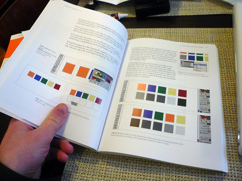
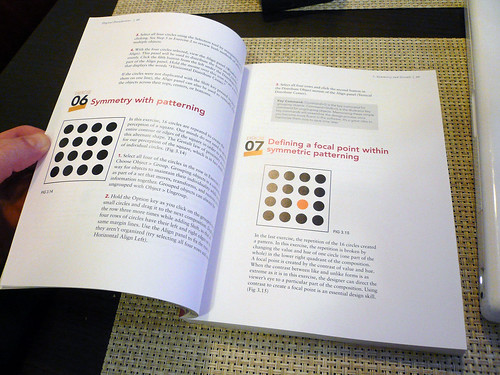
I have a copy! Its soooo real! And it looks more beautiful than I thought it would.
Buy your own copy here. Or here
Order an instructor review copy here
I think it will be shipping shortly.